
Let’s talk

Case file 01 · Brand · Naming · Identity design · Brand manual

The Bridge
Clubhouse

A members’ club at the historic Source of the Nile Hotel, in Jinja. We named it, built the brand and the strategy, and wrote the rulebook that keeps it consistent.

Client
Source of the Nile Hotel
Where
Jinja, Uganda
What we did
Brand · Naming · Identity design · Brand manuals · Brand analysis
When
2025
Cross the bridge

01The brief

A club with a
historic address.

Source of the Nile Hotel needed a brand for The Bridge Clubhouse: a premium, members-only club where Jinja’s heritage meets modern luxury.

It had to feel exclusive yet warm, rooted in Ugandan culture, and consistent from the first conversation to the last napkin. So we started with the thinking, then built everything on top of it.

  • Brand
  • Naming
  • Identity design
  • Brand manuals
  • Brand analysis
“We shape our buildings; thereafter, they shape us.”
Winston Churchill, quoted in the clubhouse’s brand guidelines

Located at the historic Source of the Nile Hotel, the clubhouse blends Jinja’s rich heritage with modern luxury: a space where history, culture and community converge.

  • 71pages in the brand manual
  • 4core brand colours
  • 3typefaces, three jobs
  • 33brand applications designed

02The researchBrand analysis & research · 27 March 2025 · Sukri Advertising & Mediate PR

Before the logo,
the listening.

Brand archetype

Mentor Guide / Advisor

Providing a space for professional and personal growth.

Innovator Visionary / Entrepreneurial

Encouraging forward-thinking ideas and progress.

Community Builder Networking & growth

Creating meaningful connections among members.

Together they make “The Visionary Connector”, representing The Bridge’s role in fostering leadership, progress and exclusivity.

Aspirational, yet inclusive.

Messaging emphasises exclusivity while keeping warmth and openness, so members feel valued and engaged.

  • The Bridge Culinary TrilogyA series of three distinct culinary events, each a unique and carefully curated Ugandan experience.
  • Eco RetreatsWeekend events promoting wellness and environmental awareness.
  • Global thought leadersExclusive access to world-renowned speakers, business moguls and industry pioneers.
  • 01An exclusive, premium social environment.
  • 02High-end culinary and Ugandan cultural experiences.
  • 03Meaningful business connections and opportunities.
  • 04Wellness and sustainability in lifestyle choices.

Character

Where the brand sits on the dial.

The guidelines pin the personality on four scales. It leans luxury and sophisticated, with a balanced, adult voice.

  • FeminineMasculine
  • LuxuryEconomy
  • YouthfulMature
  • PlayfulSophisticated

Mission & vision

From first draft to final.

Mission

To create a premium, eco-conscious haven that supports personal growth, Ugandan cultural enrichment, and community impact, while offering unparalleled services and experiences.

To provide an exclusive space blending wellness, luxury, networking, and Ugandan culture, while empowering communities through sustainability.
Vision

To be Uganda’s premier members-only club, celebrated for its exclusivity, cultural authenticity, and commitment to sustainability.

To become the leading East African premier luxury clubhouse, setting standards for exclusivity while fostering community growth and honoring the rich heritage of Uganda.

03The name

The
Bridge.

A bridge connects two sides and makes the crossing worth taking. So does the club.

  • HeritageModern luxury
  • MembersCommunity
  • Jinja’s pastA sustainable future

Naming was part of the brief. The name carries the idea in two words, and the identity was drawn to carry the name.

04The mark

One wordmark.
Four grounds.

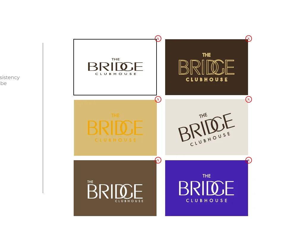
Designed to convey prestige, exclusivity and strength: tradition and authority in the letterforms, with modern refinements. Pick a ground to see the approved version.

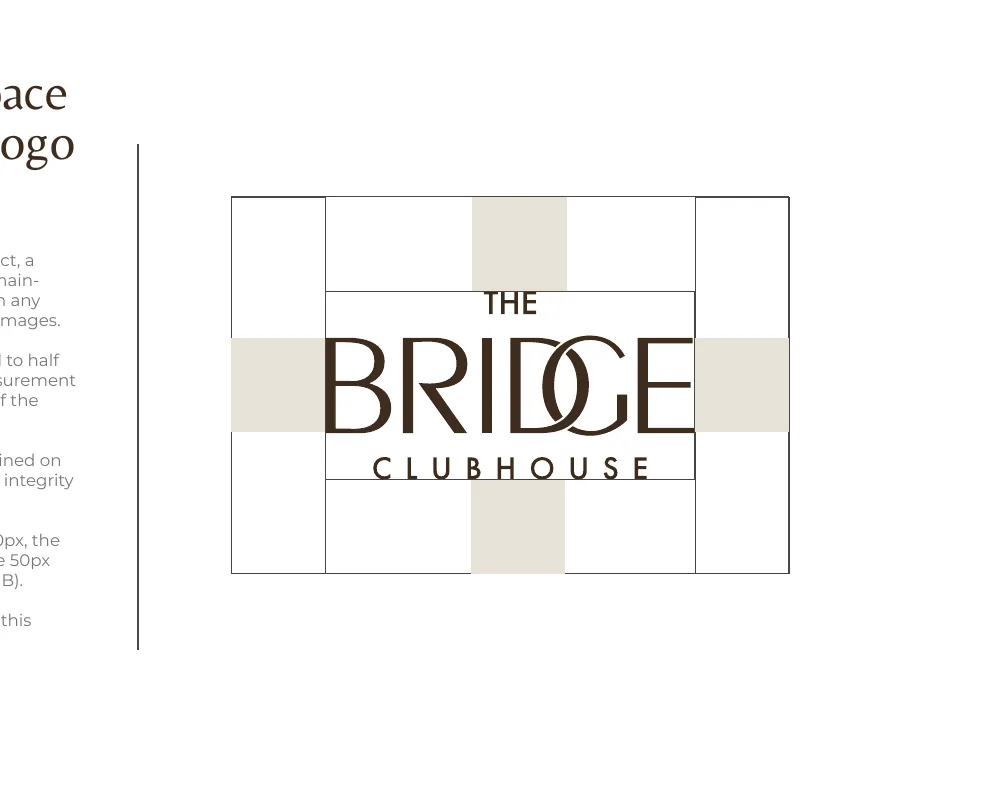
Logo clear space diagram: the space around the logo equals the height of the letter B
Room to breathe. The clear space equals half the height of the logo, the height of the B, on every side. Nothing enters it.
Logo misuse examples with off-brand colours and effects
Never this. No effects, gradients, shadows or off-palette colours. If the primary logo loses clarity, use an approved reversed or monochrome version.

05The palette

Earth tones,
on purpose.

“These colours work harmoniously to create a timeless, organic aesthetic that reflects our brand’s values.” The analysis pointed to browns, black and white; the final palette keeps the browns and adds Ecru, a warm gold.

Approved opacities · 100 · 75 · 50 · 25 · 10 %

Opacity is never improvised. Each colour, background and graphic element uses the exact approved values.

06The motif

A pattern with
a point of view.

The motif is a graphic shorthand for the brand’s values, used as a background, a texture or an accent, always at approved opacities and scales. Try it.

Ground

Opacity

Full strength as a background. Around 60% as an accent. Tied to the Ugandan craft and heritage the club draws from.

07The voice

Three typefaces.
Three jobs.

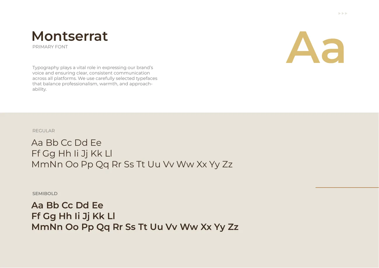
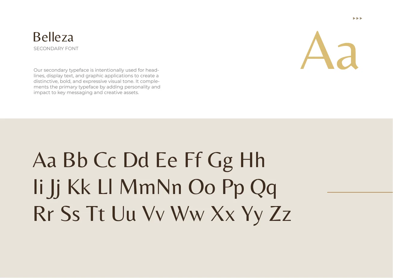
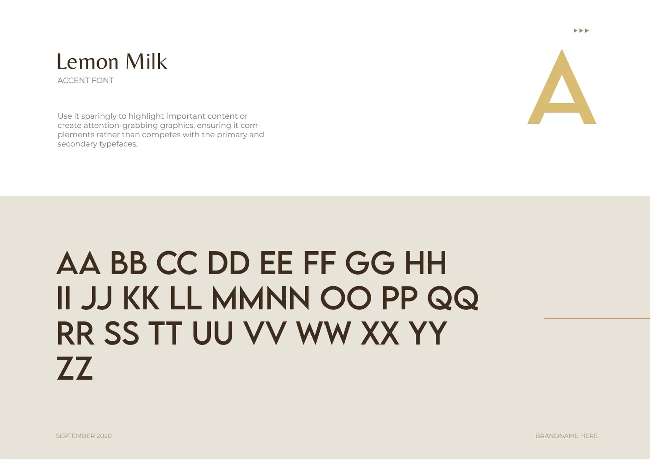
Typography balances professionalism, warmth and approachability. The analysis first suggested Lemon Milk and Baron Neue with Josefin Sans; the final system settled on this trio.

  • Montserrat specimen page from the brand guidelines

    Primary

    Montserrat

    The workhorse for body copy and everyday communication, in Regular and SemiBold.

  • Belleza specimen page from the brand guidelines

    Secondary

    Belleza

    Headlines, display text and graphic applications, adding personality and impact.

  • Lemon Milk specimen page from the brand guidelines

    Accent

    Lemon Milk

    Used sparingly to highlight important content, complementing the other two, never competing.

08The manual

71 pages.
One source of truth.

Version 1.0, May 2025. “This guide is not designed to limit creativity or innovation. On the contrary, we celebrate creative expression.” It is there to empower whoever brings the brand to life, in print, on screen and in the room.

Drag or use the arrows

09The rollout

From letterhead
to livery.

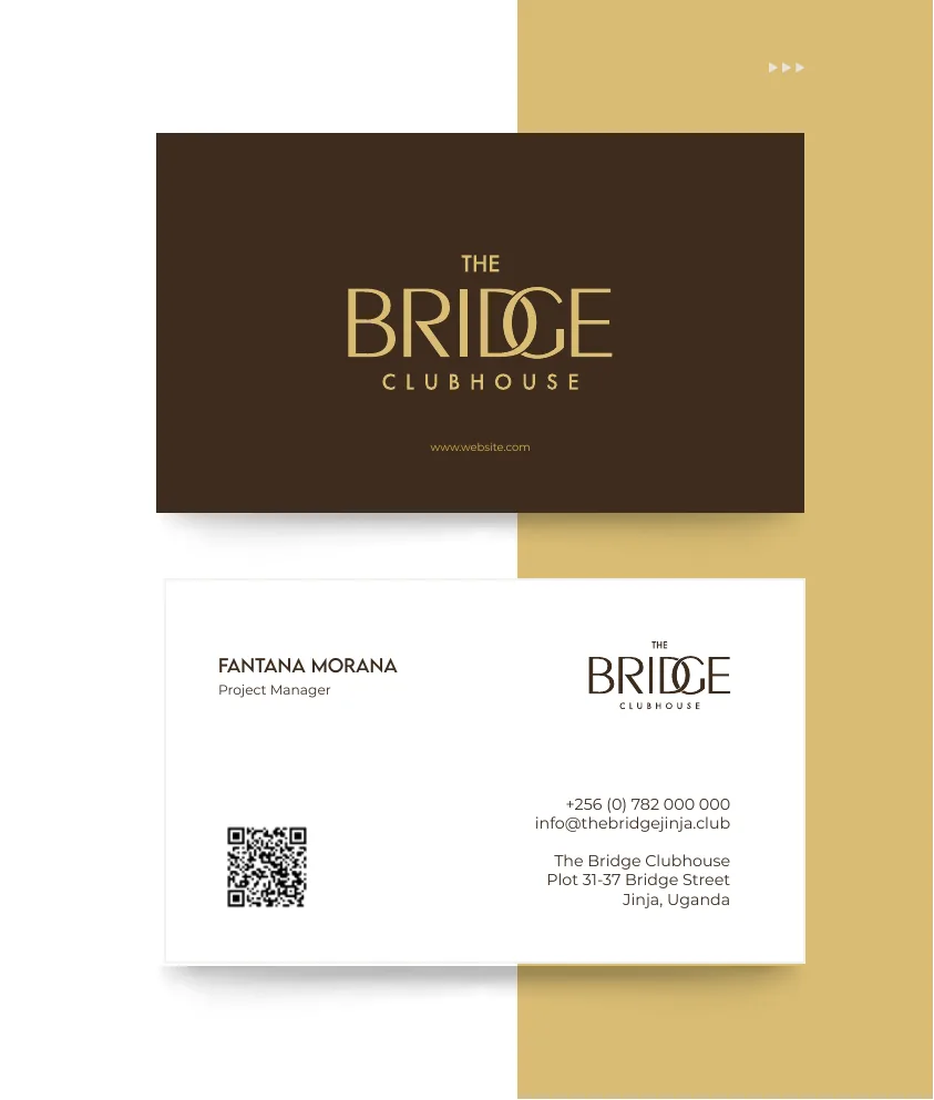
A brand is only as good as its smallest touchpoint. The identity went from the business card to the guest slipper to the van.

Business card, front and back
Business card
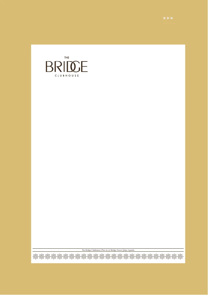
Letterhead
Letterhead · A4 · matte
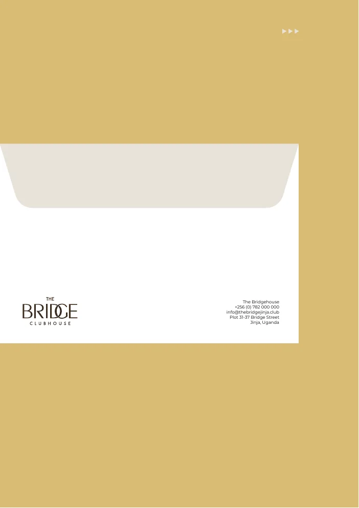
Envelope
Envelope · 6×9 in
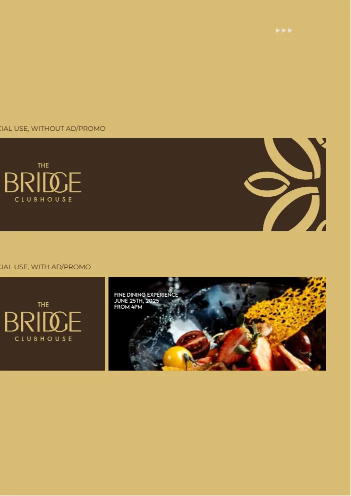
Email signature designs
Email signature

32 touchpoints shown

10The result

Today, a leading
destination
in Jinja.

The Bridge Clubhouse is now a leading destination in Jinja, Uganda. Sukri helped build the brand and the strategy behind it.

  • African identity & Ugandan heritageEvery aspect of the brand, from design inspiration to curated experiences, draws on Uganda’s cultural narratives and artistry.
  • Social impact & community empowermentLocal sourcing, skills training and zero-waste programmes, so success uplifts the people around it.
  • Ecological transition & zero wasteFrom recycling glassware to cultivating vanilla and coffee: luxury and environmental stewardship, side by side.

Next case file

Case 02 is in the edit suite.

All case files →

Final chapter · The launch

Your brief
is next.
[email protected]+256 786 205 205+256 787 662 500Plot 4 Anyirira Close, Muwuliriza Road, Kisugu, Kampala