
Mission
To provide fast, secure, and transparent digital credit that empowers individuals and businesses to act when opportunities arise.
Case file 03 · Brand foundation · Logo design · Identity

ABC Capital Bank was launching a mobile lender for Ugandans. We wrote the brand foundation, then drew the mark that carries it: the speed of fintech with the trust of a bank.
01The briefLogo design brief · July 2026
CashYO! is a new digital lending brand from ABC Capital Bank: fast, mobile-first personal and business credit for Ugandans, with a licensed bank behind it.
The audience is ambitious, mobile-first and roughly 22 to 45 years old. They are also wary of predatory quick-loan apps. So the brand had to be quick without ever looking desperate, and the logo had to prove it in a single glance.
The speed of fintech with the trust of a bank.
The name carries an exclamation mark, and the brief asked us to treat it as part of the name and explore it as a brand device.
The mark must
Left out of the mark
Every one of these says “quick cash”. CashYO! is about confidence.
02The essenceBrand foundation · Brand DNA
The core idea: financial confidence, instantly accessible. The belief behind it: money should remove barriers, not create them.
Fast when you need it. Fair when it matters. Trusted every time.
CashYO! is about
Never about
One emotion: confidence
Need
Not urgency. Not desperation.
From the emotional branding
Hope
Opportunities are possible.
From the emotional journey
Application
Minimal steps, fast onboarding.
From the customer experience
Relief
The solution is available.
From the emotional journey
Approval
Congratulations! Your money is ready. Let’s help you move forward.
A sample message from the tone of voice
Confidence
I made the right decision.
From the emotional journey
Progress
Life moves forward.
From the emotional journey
Achievement
I’m becoming financially stronger.
From the emotional journey
Mission
To provide fast, secure, and transparent digital credit that empowers individuals and businesses to act when opportunities arise.
Vision
To become Uganda’s most trusted digital financial companion, enabling millions to access responsible credit with confidence.
Core values
03The strategyPositioning · Trust · Experience
CashYO! never competes as a “loan app”. It competes as a digital lending platform backed by a licensed bank. That one decision shaped everything after it.
For ambitious Ugandans who need immediate access to money without unnecessary complexity, CashYO! is the digital lending solution backed by ABC Capital Bank that delivers fast, secure and transparent financial support with the trust of a regulated financial institution, unlike standalone lending apps that prioritise speed over customer wellbeing.
Trust is the biggest competitive advantage
Institutional
Backed by ABC Capital Bank. Licensed, regulated, professional.
Financial
Transparent fees, clear repayment schedules, no hidden costs.
Digital
Secure technology, data privacy, reliable systems, fraud protection.
Human
Simple language, helpful support, financial education.
Emotional
Never shame, pressure, or exploit financial vulnerability.
The value ladder
Read it from the bottom. Each rung is a reason for the next one.
Every interaction should feel
04The voicePersonality · Tone · Messaging
If CashYO! were a person, they would be a 30 to 35 year old financial coach: calm, knowledgeable and on your side. The brand speaks in short sentences, active voice and everyday English, with positive framing and never any pressure.
Personality
Never
Tone of voice, in practice
Sample messages from the tone-of-voice guide. Even a “no” keeps the door open.
 CashYO!now
Congratulations! Your money is ready. Let’s help you move forward.
Not this time, but we’re here to help. Keep building your eligibility.
Just a friendly reminder that your repayment is due on Tuesday.
Opportunity is waiting. Let’s help you take the next step.
Master message
Money should never
keep you waiting.
Fast money. Fair lending. Trusted banking.
Sample taglines
Money That Moves With You
05The directionsLogo concepts · Round one
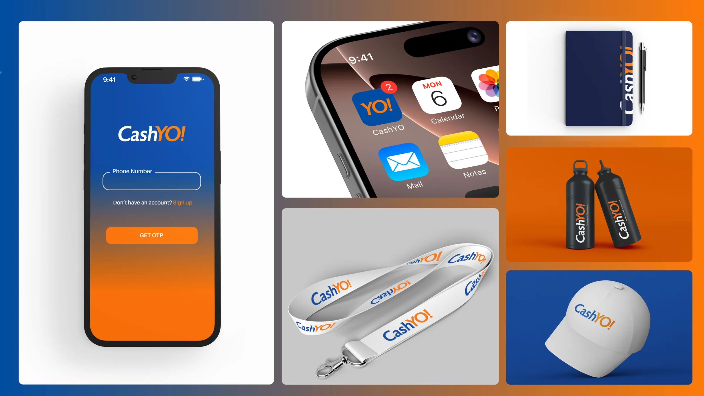
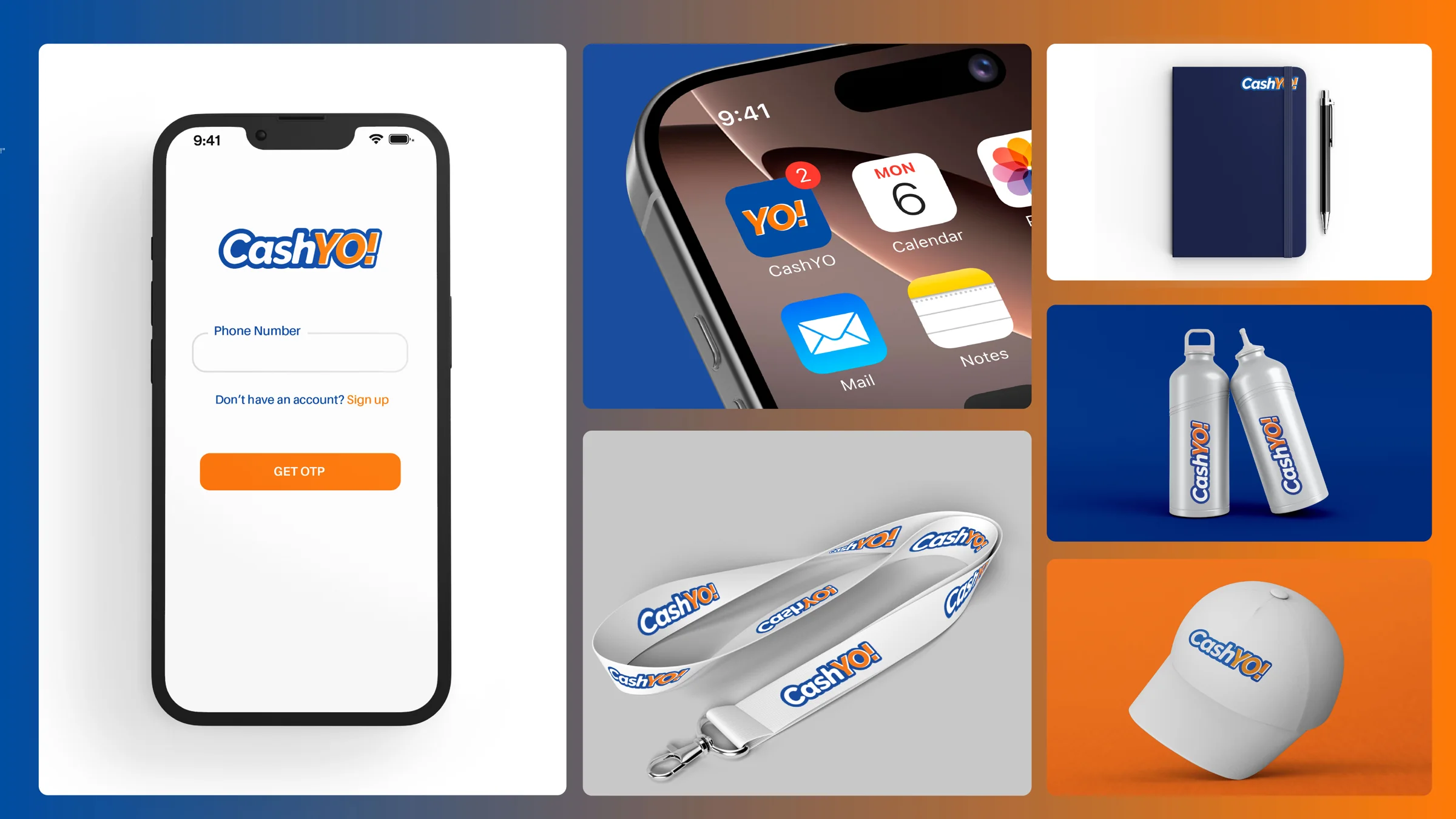
Each direction was presented the same five ways: wordmark, endorsement lockup, icon, wordmark on dark, and next to the ABC Capital Bank logo. Then we put each one on a phone, a bottle and a cap. Flip between them.
A light italic wordmark with a green YO!.





A heavy italic with a white keyline, and a bold YO! as the icon.




The Y becomes a rising stroke, and the O takes a leaf-like flick.





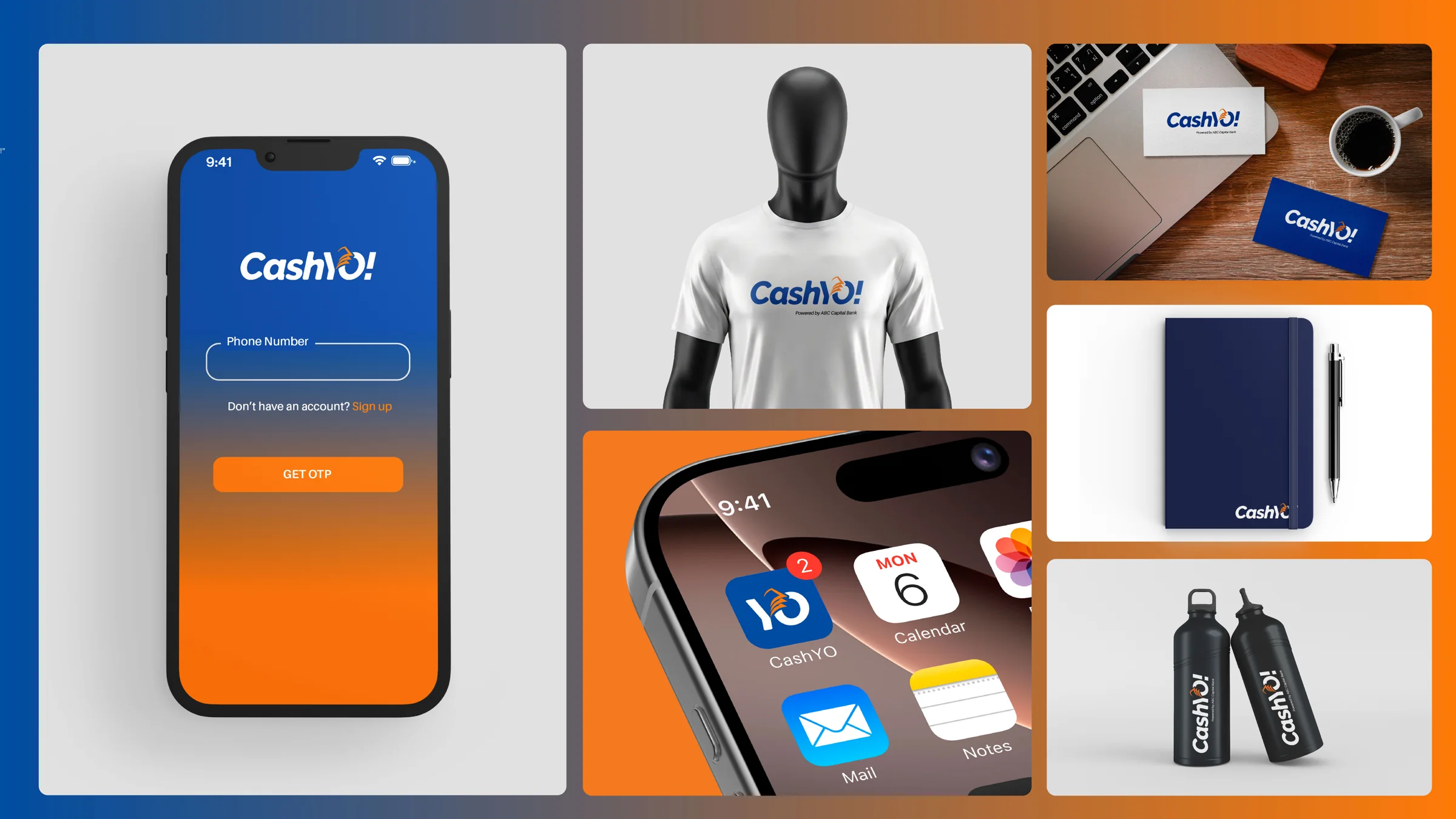
Direction 02 is the one that grew into the final mark. The first round was drawn in navy and green; the final moved to blue and orange.
06The markThe final logo package
The exclamation mark is part of the name, so it became part of the system. The full wordmark does the talking, the endorsement line brings the bank, and the icon keeps the best two letters for the home screen. Switch between the five final files.



Drawn for CashYO! alone. It is a modified letterform, not any specific font, so the exclamation mark and the YO! sit in the name as one shape.
On brand blue, Cash goes white and YO! stays orange. Same shape, same weight, no second logo to learn.
“Powered by ABC Capital Bank” sits beneath the wordmark in Aileron italic. The bank is clear, and it never takes over.
For co-branded moments, the wordmark and the ABC Capital Bank logo sit side by side with a thin rule and the endorsement line between them.
YO! on a rounded square. Short enough to read at the size of a thumbnail, bold enough to stay the same mark as the full name.
The small-size test
The brief called for a mark that works as a small app icon. Here is the icon at working sizes, and a slider to shrink the wordmark all the way down.
16 pxFavicon29 pxSettings40 pxNotification60 pxHome screen120 pxStore07The paletteTwo colours · One supporting font
The final package runs on one blue and one orange. Click a block to copy its code. Aileron is the supporting font, and the wordmark itself is custom-drawn.
From first pass to final
08The rolloutConcept boards
Every direction was tried on the same kinds of surfaces: the login screen, the home screen, a lanyard, a cap, a notebook, a bottle. Pick a direction, pick a surface, and open any tile to see it larger.
18 mockups shown
09The north starStrategic north star
Uganda’s most trusted digital lending brand.
Combining the convenience of fintech with the credibility, transparency, and long-term relationship expected from a regulated bank gives CashYO! a stronger emotional connection and a more defensible market position than competing on speed alone.
What was handed over
Open each folder to see what the team received.
Next case file
04 · Sqillpad, the e-learning platform for Uganda’s classrooms.
Final chapter · The launch
Your brief