Vision
A community free of the spread of HIV where those persons already infected and affected by HIV and AIDS are living positively with an improved quality of life.
Case file 02 · Brand refresh · New logo · Brand manual
Nearly twenty years of community health work needed an identity that worked as hard as the people behind it. We redesigned the logo and wrote the rulebook.
Drag to reach out
01The briefTerms of reference · 25 November 2020
Reach Out Mbuya Community Health Initiative is a faith-based organisation serving extremely vulnerable communities in Uganda. It began in the slums of Nakawa Division, Kampala, and was deepening its work beyond HIV into more infectious and non-communicable diseases.
Its holistic model of care joins medical care, social support and community network. The brief: redesign the logo, then build a comprehensive manual so that every associate presents the organisation the same way.
“A strong, clear, consistent brand presence.”
A manual that acts as a branding reference in the organisation, representing its identity, enhancing its visibility and helping beneficiaries and the public understand what it hopes to achieve.
The brief, line by line
02The essence
The brand promise. Anchored in a holistic model of care, ROM runs programmes in medical care, prevention and psychosocial support, and community support, inspiring hope and empowering people to sustain themselves for a better tomorrow.
Four brand attributes
We are consistent in performance and service delivery.
We appreciate and relate with the communities we serve.
We reach out to the extremely vulnerable, in rural and urban settings.
We empower individuals, families and communities to break the extreme vulnerability traps by integrating sustainability.
Vision
A community free of the spread of HIV where those persons already infected and affected by HIV and AIDS are living positively with an improved quality of life.
Mission
To curb the further spread of HIV infection among the less privileged members of society and enable those already living with HIV and AIDS to live a responsible and dignified life.
Core values
03The diagnosisThe standard filter
A good trademark is not about what one likes or dislikes. It is about what works. So we put the old mark through four questions.
Is it appropriate?
The design style should make sense for the industry and audience.
What we asked of the old markA community health organisation needs warmth and trust, not decoration.
Is it distinct?
The design style should be easily memorable and stand out, not get lost in the sea of competition.
What we asked of the old markOne idea people can recall: a person reaching out to another.
Is it simple?
Too many details are distracting and easily forgettable.
What we asked of the old markThe old mark carried a curved headline, a second curved line, two figures, a script tagline and small type.
Is it versatile?
The mark must keep its proportions big and small, and look equally good on black and white surfaces.
What we asked of the old markLettering and figures had to survive a name badge, a banner and a one-colour print.
The idea was right: people reaching toward each other. The job was to keep that idea and remove everything standing in its way.
04The redesignThree rounds, one idea
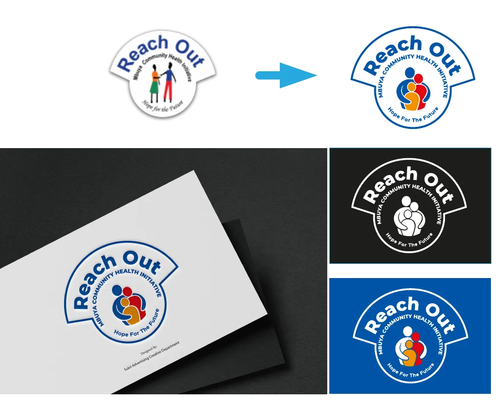
Step through the work. Each round was shown on a card, on black and on ROM blue, because a mark that only works on white isn’t finished.
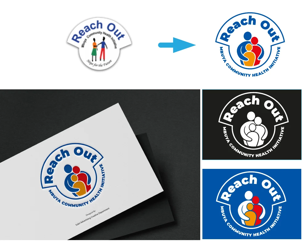
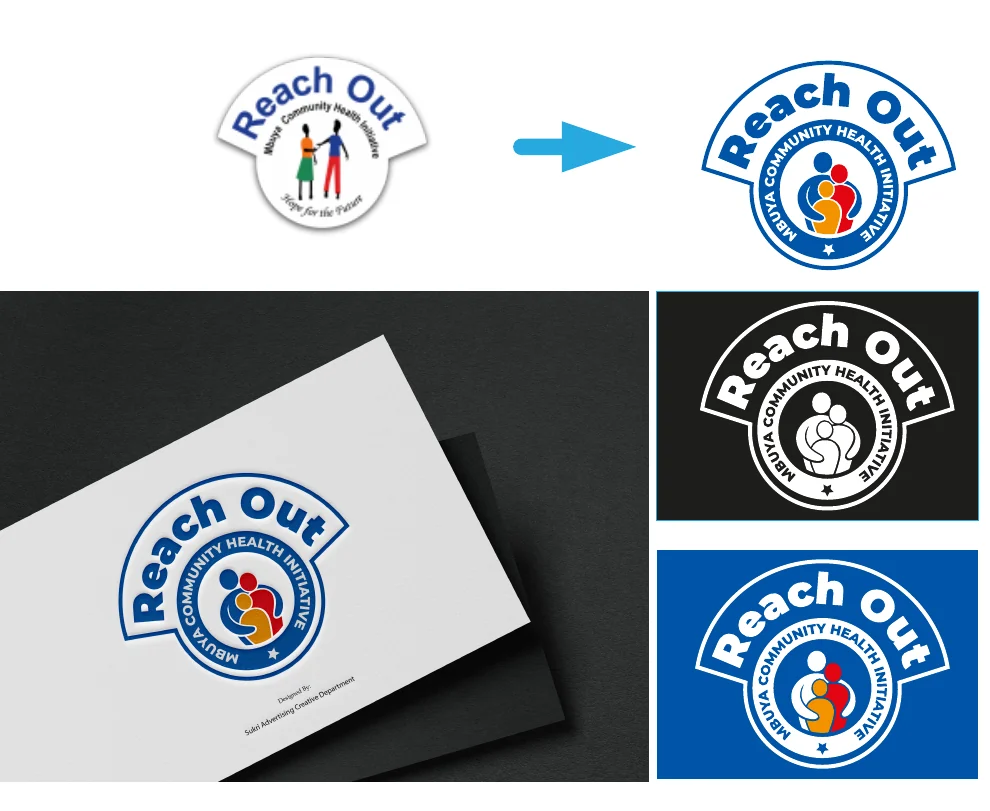
Original
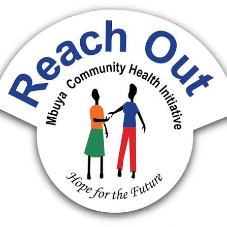
An arched headline over a fan-shaped top, two figures shaking hands, a second curved line of small type and a script tagline.
Round 1
The raised top is kept but the lettering is bolder, the figures become a family group, and the tagline sits inside the ring.
Round 2
The family icon gets bigger and braver, the supporting lines move around the ring, and the tagline leaves the badge.
Round 3
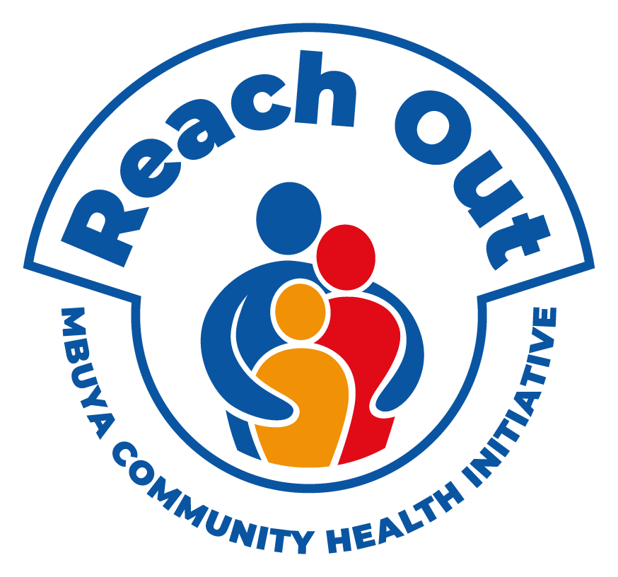
The ring becomes a full circle with a star at its base, the lettering tightens, and the tagline becomes its own lockup.
05The mark
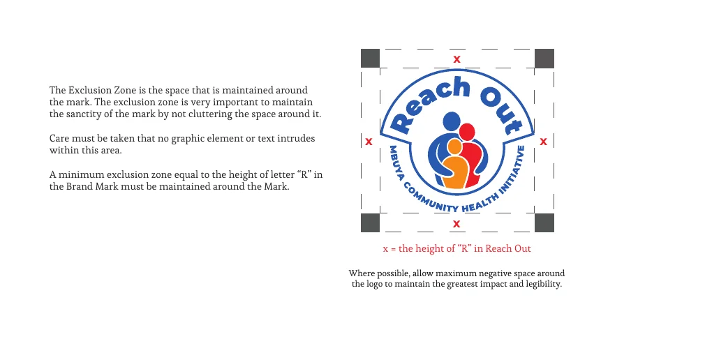
“Our logo has a logotype spelling out the organisation’s full name, with icons in the middle representing a family taken care of.” Tap the pins to read the mark.
1 · The family
Representing a family taken care of: the heart of what ROM does.
2 · The colours
The different colours denote the different communities ROM serves, and their diversity.
3 · The reach
It denotes the missionary nature of the organisation: reaching out to the extremely vulnerable.
Permitted backgrounds
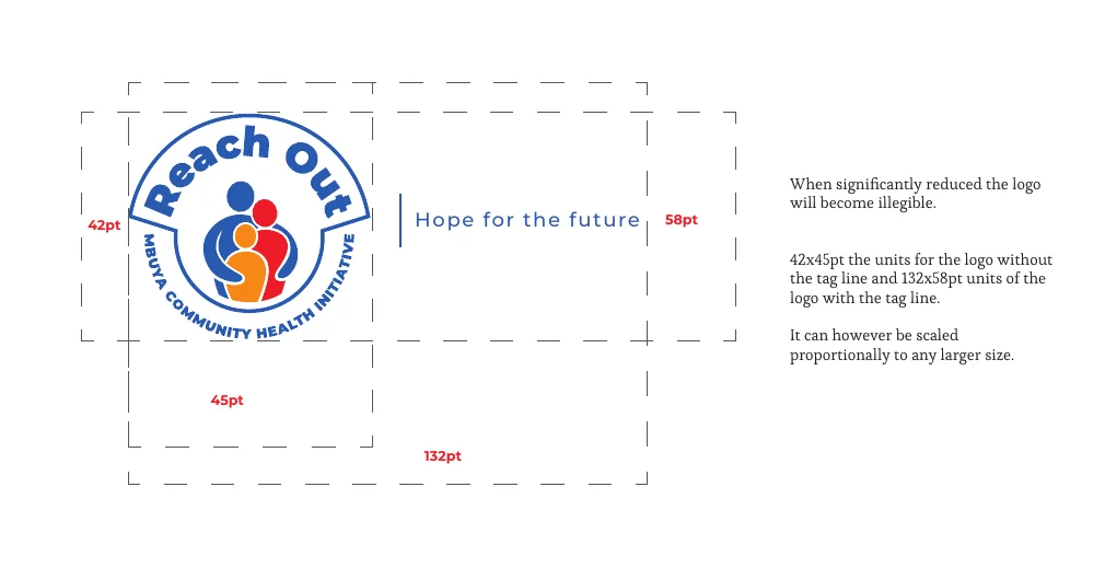
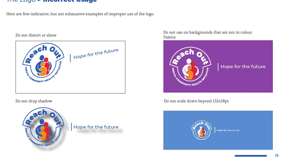
The icon alone can also be used as a 10% grey watermark and, in full colour, as the favicon. The logo is a registered trademark.
06The palette
ROM Blue carries the identity. Orange, red and mint cream appear in measured doses, so the palette stays calm and the accents still mean something. Hover a block or tap it to see the codes; click to copy.
#0D55A3
Pantone 2945C
RGB 13 · 85 · 163
CMYK 95 · 67 · 0 · 0
#F39208
Pantone 144C
RGB 243 · 146 · 8
CMYK 0 · 50 · 97 · 0
#E20D18
Pantone 199C
RGB 226 · 13 · 24
CMYK 0 · 99 · 97 · 0
#E6EFE9
Pantone 7547C
RGB 230 · 239 · 233
CMYK 4 · 0 · 3 · 6
The blue family
07The voice
Fonts that are already on every PC and Mac keep the organisation consistent everywhere, with Montserrat and Esteban for headings and display. Hierarchy comes from weight: black for programmes, bold for services, regular for the story.
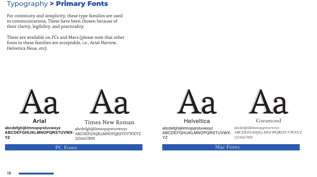
Primary
With Times New Roman and Garamond for body text. Chosen for clarity, legibility and practicality.
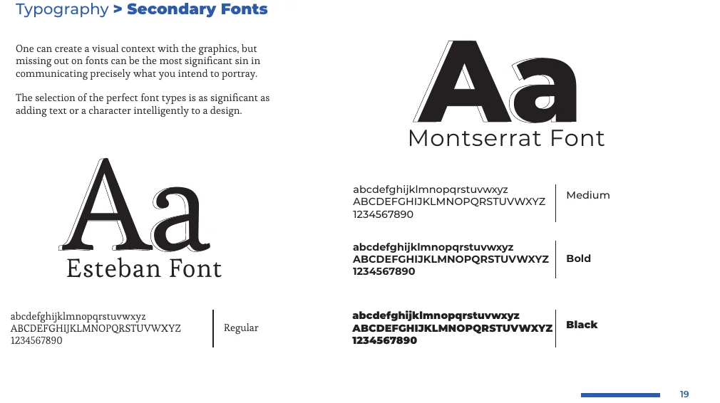
Secondary
For headings, display and anywhere the brand needs a little more personality.
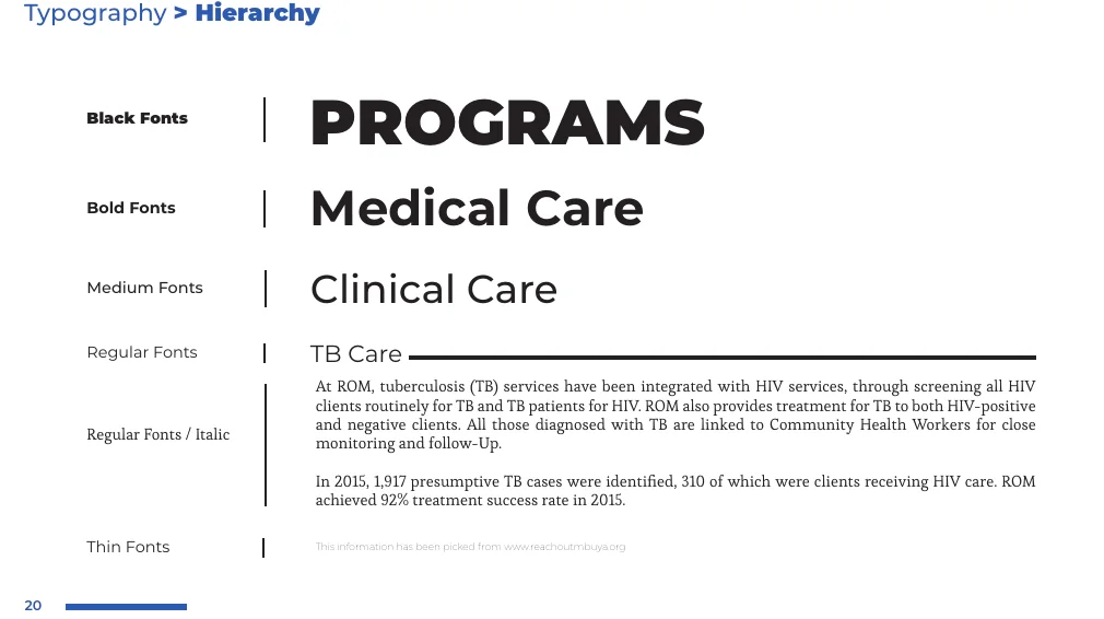
Hierarchy
Black, bold, medium and regular, each with a job.
Tone of voice
Plain language, short sentences and active voice. The look follows: clean and formal with an expressed style, never eccentric.
08The language
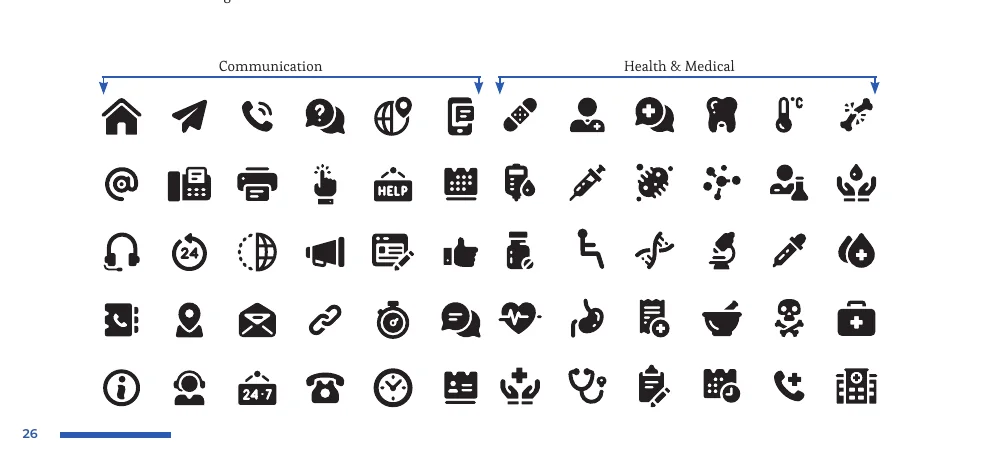
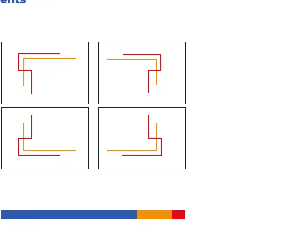
A small graphic vocabulary that makes any page unmistakably ROM: a filled icon set for communication and health, corner elements built from the colour bar, and a seamless pattern for texture. Try the pattern.
Ground
Strength
For any collateral that needs a seamless background or a visual texture.
Photography should feel
Inspiring, positive and natural, with warm light and real moments from daily life at ROM.
09The manual
Version 1.0, 2021. “The success of maintaining ROM’s corporate identity depends on the ownership of its goals and values by every associate.” So the manual explains the why before the rules: philosophy, logo, type, colour, graphic language, photography, application and signage.
10The rollout
The identity was designed for the whole organisation: the front desk, the clinic, the community outreach day and the delivery truck. Filter the touchpoints.
23 touchpoints shown
11The handover
Nearly twenty years of work on the ground now carries a single identity, with a rulebook that lets every associate present it the same way. The mark is a registered trademark; the manual keeps it that way.
What was handed over
Open each folder to see what the team received, from editable templates to the logo in every format.
Next case file
03 · CashYO!, the bank-backed digital lender.
Final chapter · The launch
Your brief