
Case file 05 · Interior design · Build
Sqillpad
Care Centre
Where Sqillpad tablets are bought, brought in for repair, and where parents and guardians learn the product hands-on. We planned the floor and designed every corner of it.
- Client
- Sqillpad
- Where
- Uganda
- What we did
- Interior design · Build
- When
- 2025
01The briefDesign proposal · 8 March 2025
A shop, a workshop
and a classroom.
Sqillpad runs on browsers, Android devices and its own Sqillpad tablets. Those tablets needed a home: a place to buy them, bring them back for repair and maintenance, and see the platform up close.
Parents and guardians needed somewhere to learn about the e-learning product hands-on, not just read about it. One small space had to do all three jobs without feeling like any of them was in the way of the others.
Functional. Appealing. Easy to use.
To design a functional, aesthetically appealing and user-friendly Sqillpad Care Centre that aligns with the brand’s vision and service offerings.
Key focus areas
- 01Accessibility
- 02Workflow efficiency
- 03Comfort
- 04Branding
- 5zones planned, from reception to repair
- 2floor plans, empty and furnished
- 103D renders
- 16pages in the proposal
02The visitThree reasons to walk in
Who walks in
decides the route.
The plan starts from the people, not the furniture. Pick a visitor and follow the path they take through the centre.
- 0Reception
- 0Experience zone
- 0Sales & technical support
- 0Storage & repair
Check in at a branded reception, try the tablets and demo screens hands-on, then talk it through with the sales team.
Check in, explain the problem to the technical team, and the repair happens at a secure workstation right behind them.
Check in, then learn the e-learning product on the demo stations, with the team close enough to answer questions.
03The planFloor plan · Space planning
Empty room.
Working room.
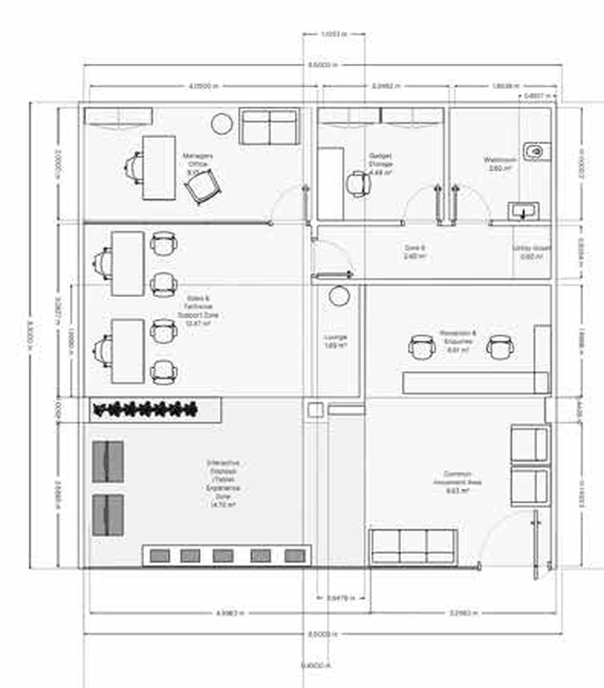
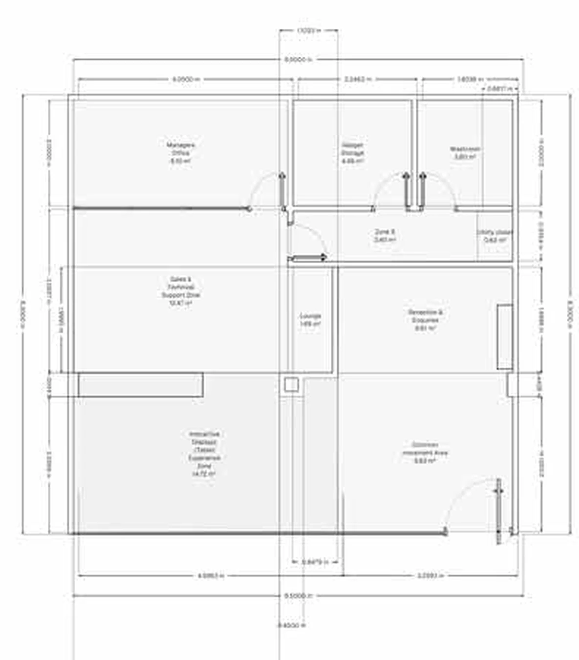
The same footprint, about 8 × 8 metres, before and after. Drag across to see where the desks, displays, seating and shelving land.
04The roomsSpace planning & flow
Click a room.
See it rendered.
Each zone on the plan has a job and a render. Select one on the plan or from the list.
The first point of contact
Reception & Enquiries
- A welcoming, branded ambiance
- Comfortable waiting area with modern seating
- Quick check-in for smooth customer handling
Where the product gets touched
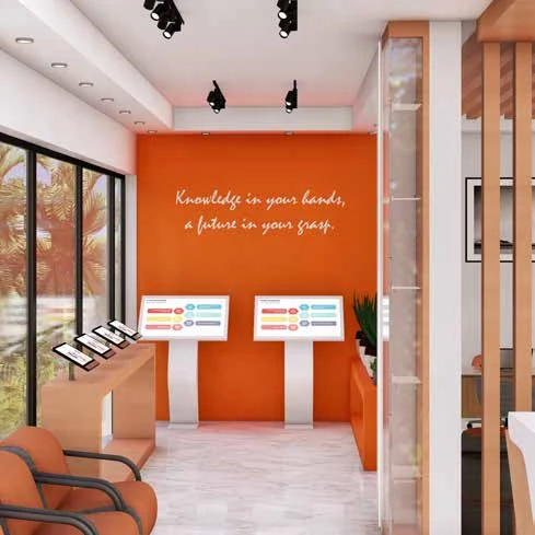
Interactive Display / Tablet Experience Zone
- Customers explore products and services hands-on
- Digital screens and demo stations for an immersive experience
- Clear pathways for easy navigation
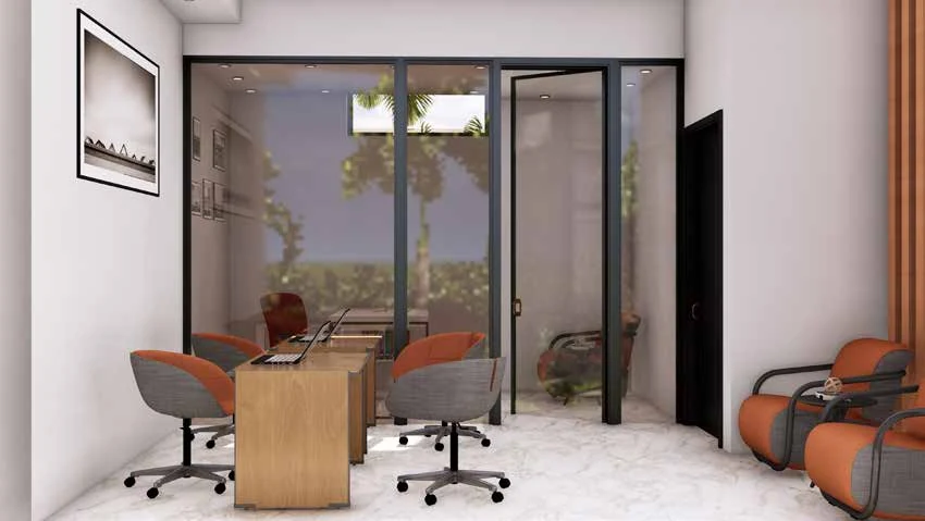
Consultations, inquiries, troubleshooting
Sales & Technical Support Zone
- Dedicated space for consultations and troubleshooting
- Ergonomic workstations for efficient service
- Seamless connectivity between sales and technical teams
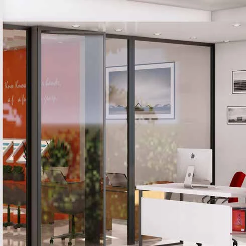
Overseeing, with privacy
Manager’s Office
- Placed to oversee operations while keeping privacy
- Tech and meeting space for client discussions
No render for this room in the proposal. It is shown on the furnished plan.
Storage and repair
Gadget Storage
- Well-organised shelving for spare parts and inventory
- Secure workstation for repairs and servicing
- Close to the technical support zone for quick access
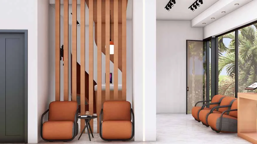
Waiting, with room to move
Common Movement Area
- Seating along the entrance wall
- Open floor so nobody queues in the way of a demo
05The walk-throughTen renders
Through the door,
left to right.
From the glass frontage to the manager’s office: orange, timber, white and green, with the Sqillpad logo never far from sight. Drag, or use the arrows. Open any render to see it larger.
06The brandIdentity, in three dimensions
Flame orange,
in a room.
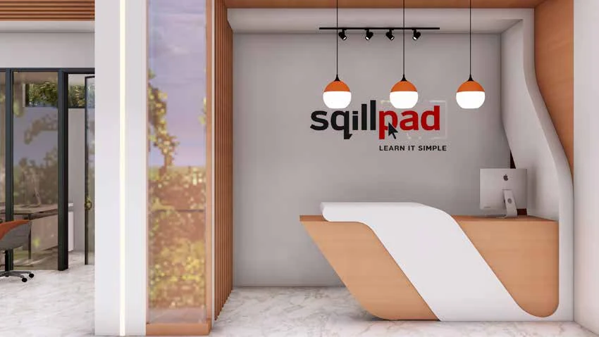
The identity from the Sqillpad manual walks off the page: the logo and tagline on the reception wall and the glass, the brand orange on the feature wall and the seating. Tap the pins.
1 · The wall
Knowledge in your hands, a future in your grasp.
Wall copy on the brand-orange feature wall, set in script so it reads as a promise, not a slogan.
2 · The demo screens
Hands-on, not hands-off.
Digital screens and demo stations let visitors explore the product themselves.
3 · The display bench
Tablets to pick up.
The Sqillpad tablets sit within reach, at counter height, ready to try.
4 · The waiting seats
Comfortable and modern.
Orange armchairs echo the brand colour in a place where people wait.
What you can see in the renders
- Brand orangeFeature wall, counters and armchairs
- Timber finsVertical slats that screen the waiting area
- White and timber deskA curved reception desk under the logo
- Glass and black framesThe frontage and the partitions
- Pendants and track lightsPendants over reception, track lights over the displays
- PlantingGreenery along counters and sills
07The proposal16 pages · 8 March 2025
One small room.
Three big jobs.
Buy, repair, learn. The Care Centre puts all three under one roof and one brand, so a parent trying a tablet, a teacher dropping one off and a technician fixing it never need to leave the same orange-and-timber room.
What the proposal contained
A plan, a flow and a view.
Open each folder to see what the client received.
Introduction
- The objective
- Key focus areas: accessibility, workflow efficiency, comfort and branding
Floor plans
- The empty plan with walls, doors and dimensions
- The furnished plan with desks, displays, seating and shelving
Space planning and flow
- Reception area
- Interactive display and experience zone
- Sales and technical support zone
- Manager’s office
- Storage and repair area
3D visuals
- Ten renders from the frontage to the manager’s office
Next case file
Case 06 is in the edit suite.
Final chapter · The launch
Your briefis next.↗